Primary Font
We use Vivint Circular as our primary font. It's recognizable, and ensures readability throughout our communications.


Hierarchy & Weights
Hierarchy
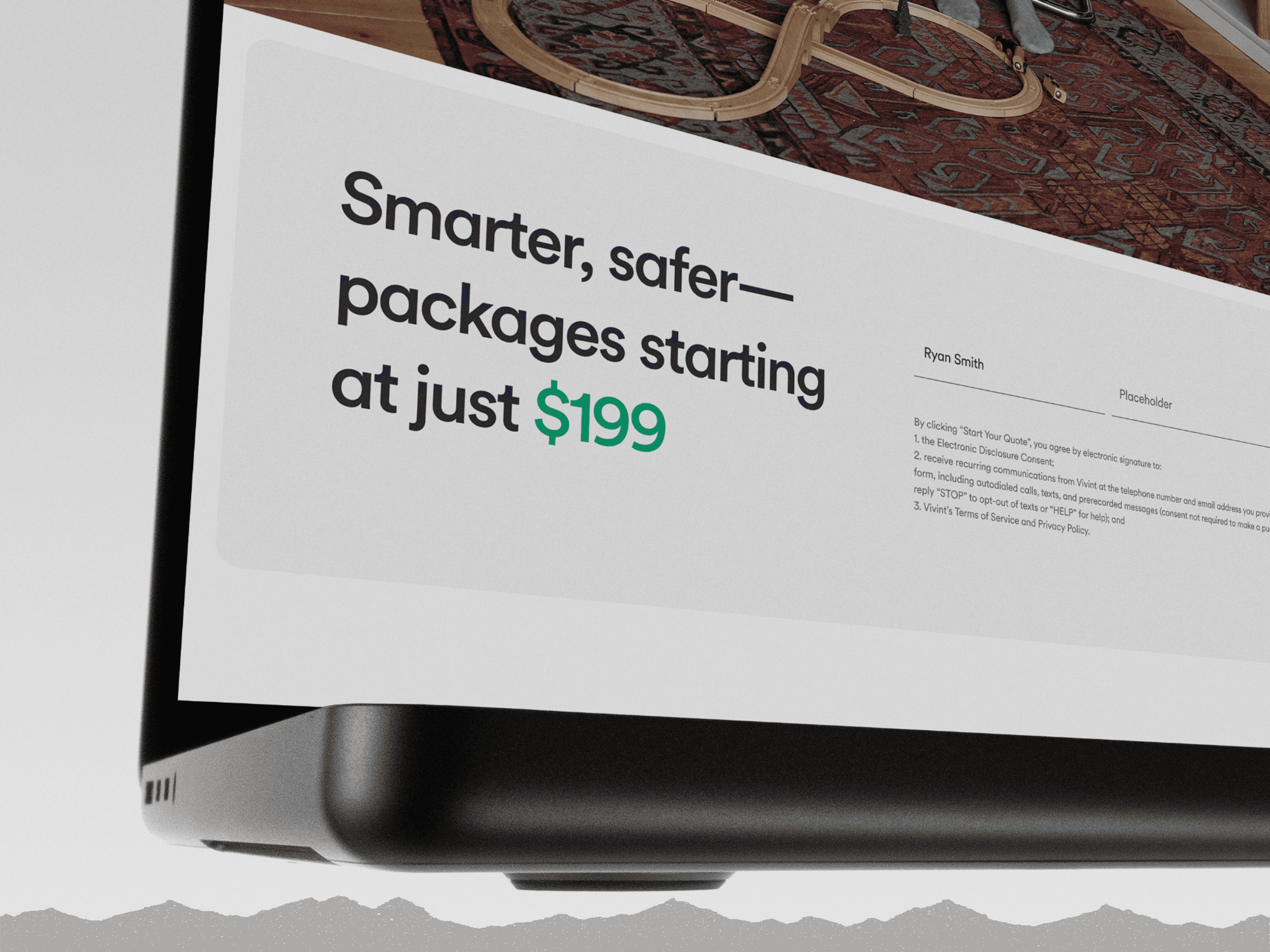
Size, scale and position all play a factor in how information is read. Always ensure there is a purposeful difference between type sizes. Type sizes are for example only.
eyebrow, in all caps, 1/4 the size of the headline
Headline, 4x the size of the eyebrow, 2x the size of the subline.
Subline, 1/2 the size of the headline.
This is a small amount of body text. 1/4 the headline size, the same size as the eyebrow.
Weights
We’re intentional about our font weight and style choices. Within the Vivint Circular family, we primarily utilize Medium and Regular weights.
Don't

Don't use any old brand fonts, like Vivint Rounded.

Don't use any old brand fonts, like Vivint Sans.
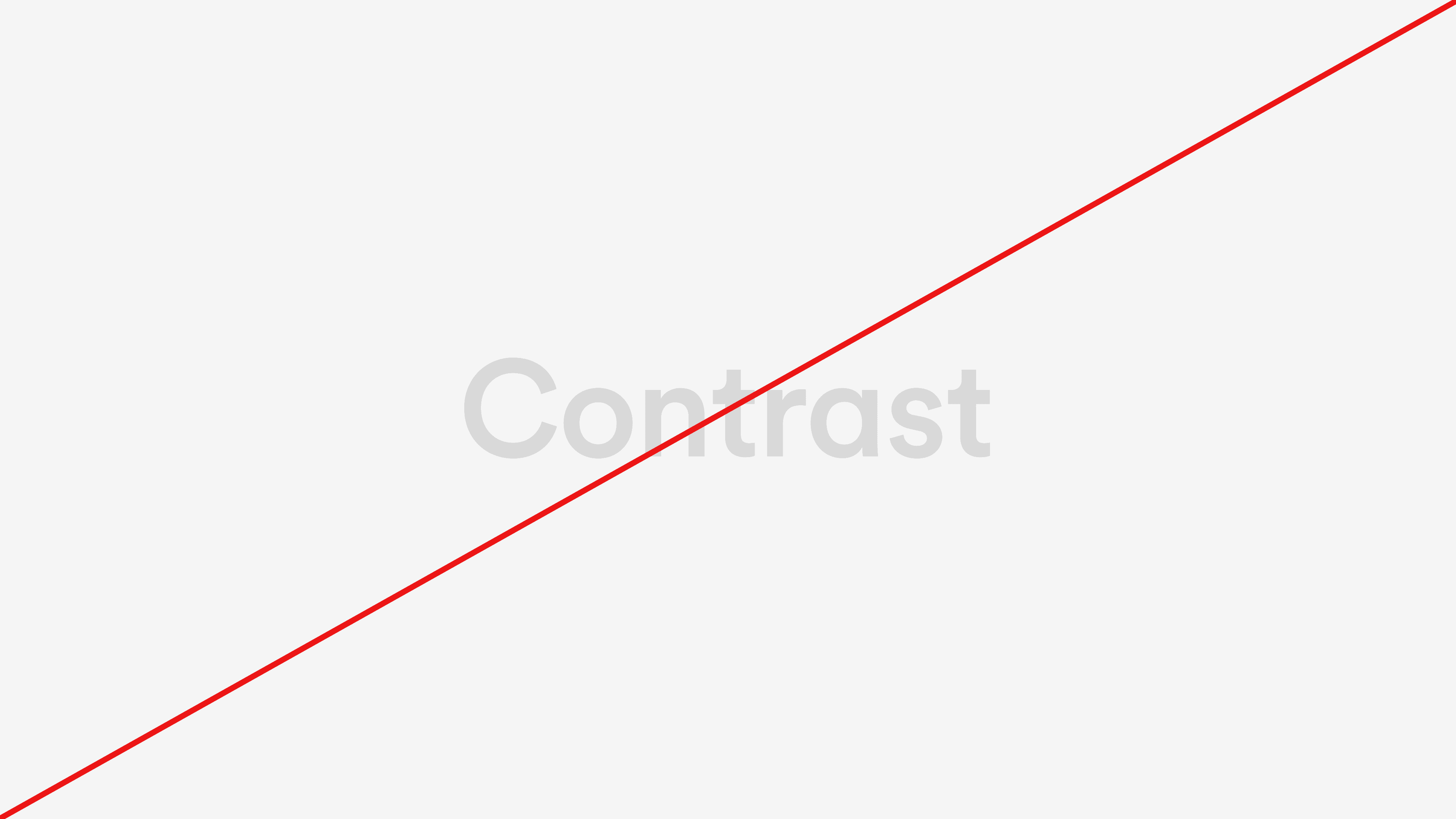
Make sure text has enough contrast to meet accessibility standards.